Efficiency Through Design
Introduction
The benefits of utilising a design system are widely recognized, particularly in the realm of large and complex products with multiple contributors. However, the significance of a design system extends beyond established products.
In the case of emerging products before there are many screens and user flows, a design system can become a foundational tool. It acts as a starter kit. Aids in constructing a coherent mental model for users, thereby simplifying navigation through unfamiliar interfaces.
In the case of emerging products before there are many screens and user flows, a design system can become a foundational tool. It acts as a starter kit. Aids in constructing a coherent mental model for users, thereby simplifying navigation through unfamiliar interfaces.
Roles and Responsibilities
- Initiation of the Design System effort, including obtaining necessary resources from the product and development departments.
- Define key parameters of the design language.
- Set the scope of components.
- Hands-on work designing assets and components.
Key parameters
Color:
To choose the color scheme we would work with, we had to analyze our users' needs. Since SWAPP.ai deals solely with construction plans, which are typically large diagrams primarily drawn in black and white, color is only utilized to emphasize changes or segments requiring specific attention. Consequently, we opted for a dark base color to ensure that the plans stand out above all interface elements.
To choose the color scheme we would work with, we had to analyze our users' needs. Since SWAPP.ai deals solely with construction plans, which are typically large diagrams primarily drawn in black and white, color is only utilized to emphasize changes or segments requiring specific attention. Consequently, we opted for a dark base color to ensure that the plans stand out above all interface elements.
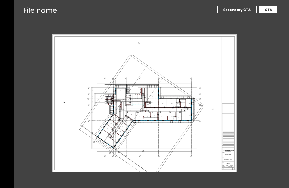
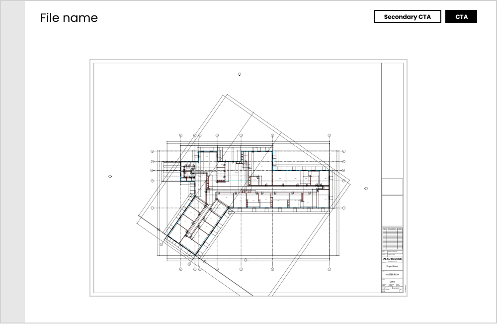
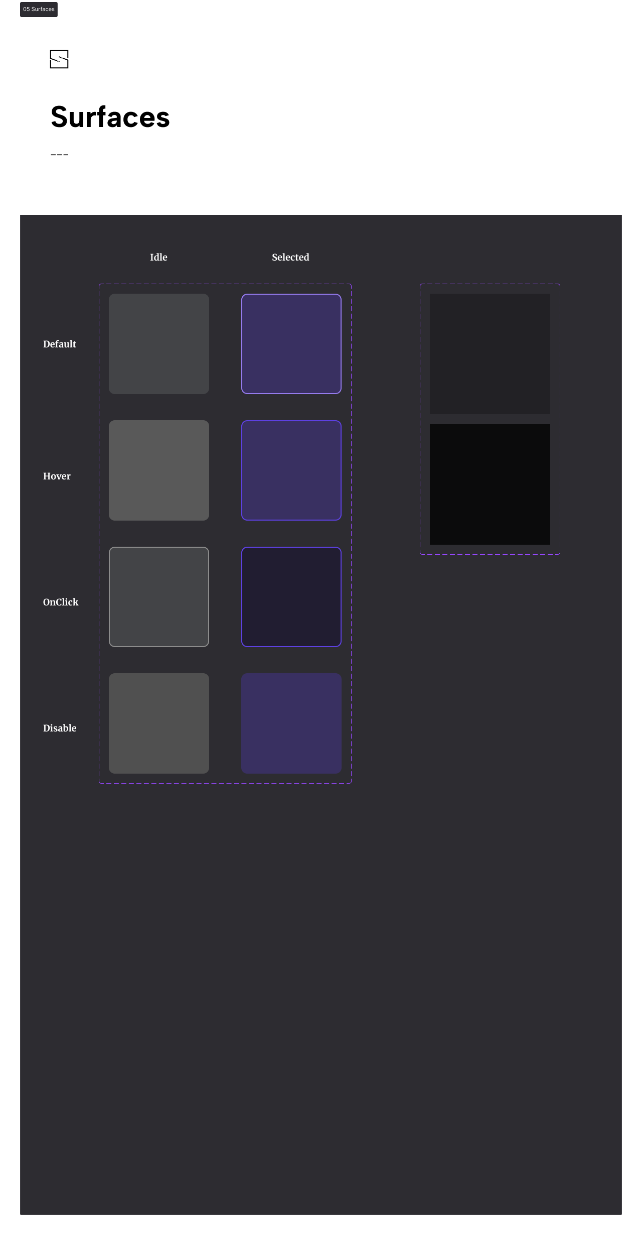
To create a hierarchy of colors providing a mental model of surfaces, we established that the construction plans represent the top level of surface, with nothing standing on top of them.
Principal layers order
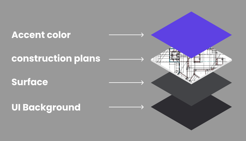
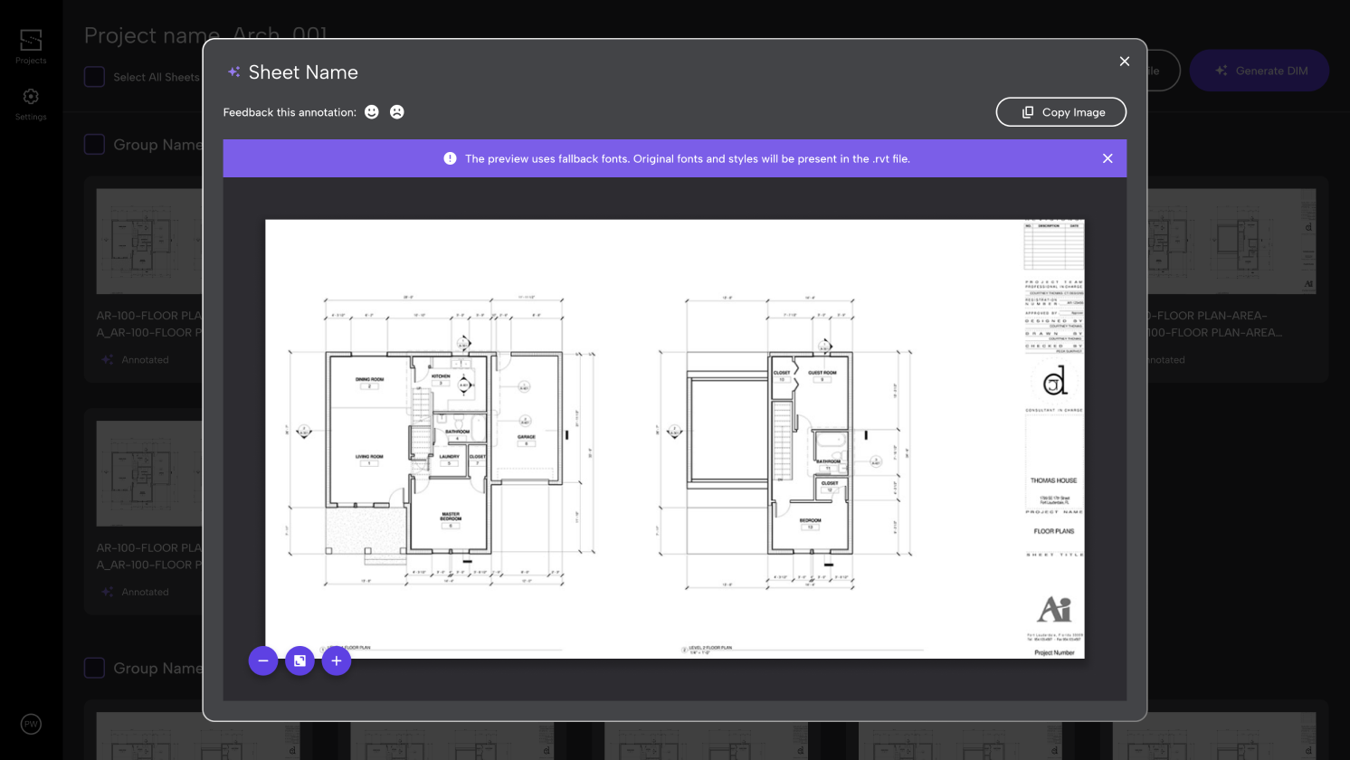
Layers implemented
Size metrics:
By examining our users' work environment, we determined the sizing metrics we would use. Our product is designed to be a work tool primarily used on desktops. Our users, who are architects, typically work in an office environment where it is common to utilize two large displays at their workstations. This is why we chose to implement a 6px gap system, providing flexibility in sizing while ensuring that there are distinct visual "jumps" in sizes. This approach allows users working at a desk distance from their displays to easily distinguish between different hierarchies.
![18px Vertical gap]()
![30px Vertical gap]()
![48px Vertical gap]()
By examining our users' work environment, we determined the sizing metrics we would use. Our product is designed to be a work tool primarily used on desktops. Our users, who are architects, typically work in an office environment where it is common to utilize two large displays at their workstations. This is why we chose to implement a 6px gap system, providing flexibility in sizing while ensuring that there are distinct visual "jumps" in sizes. This approach allows users working at a desk distance from their displays to easily distinguish between different hierarchies.


Desing System basic elements
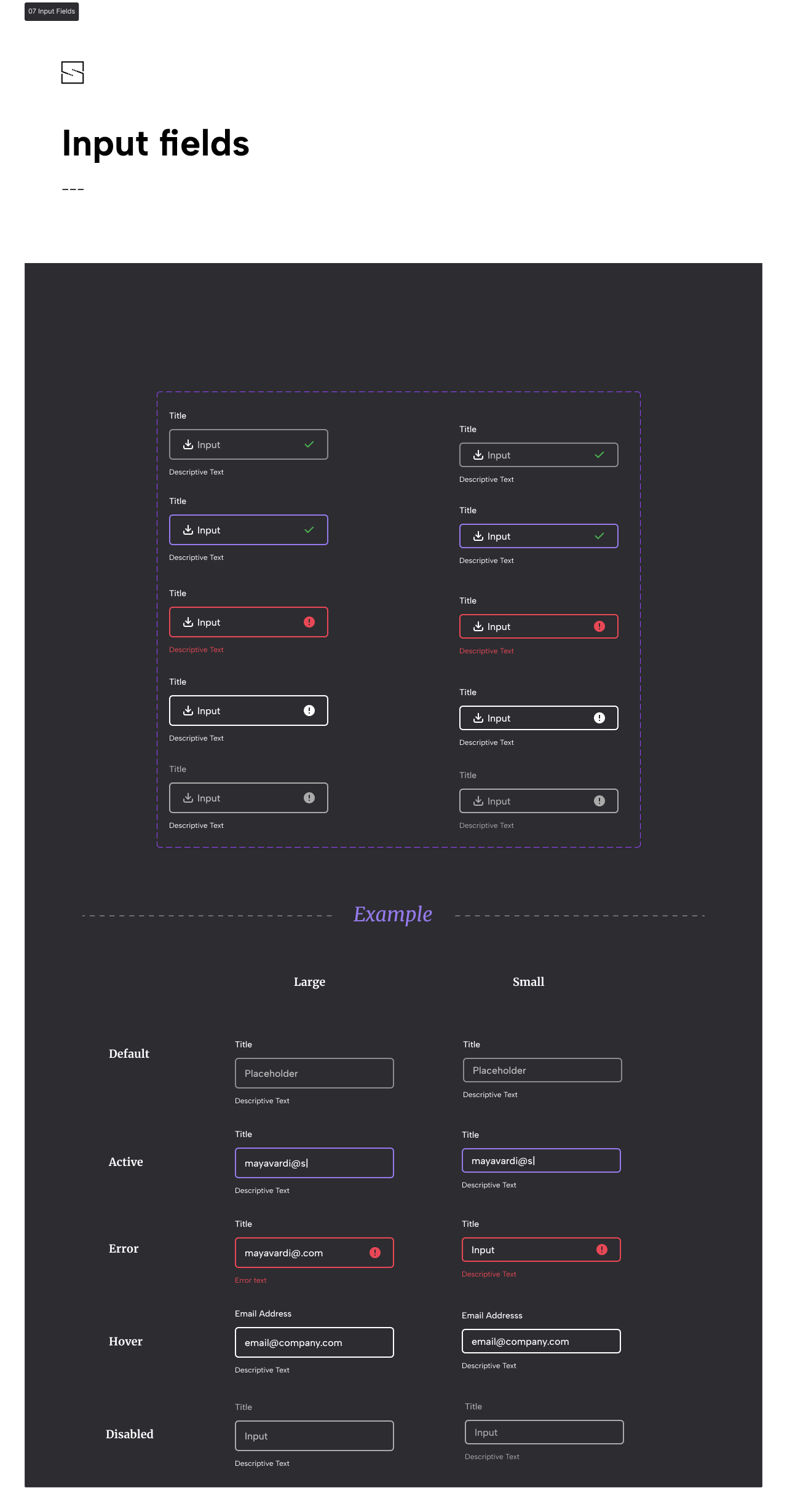
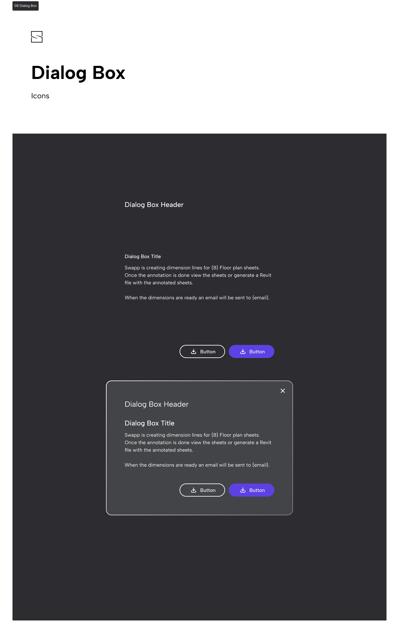
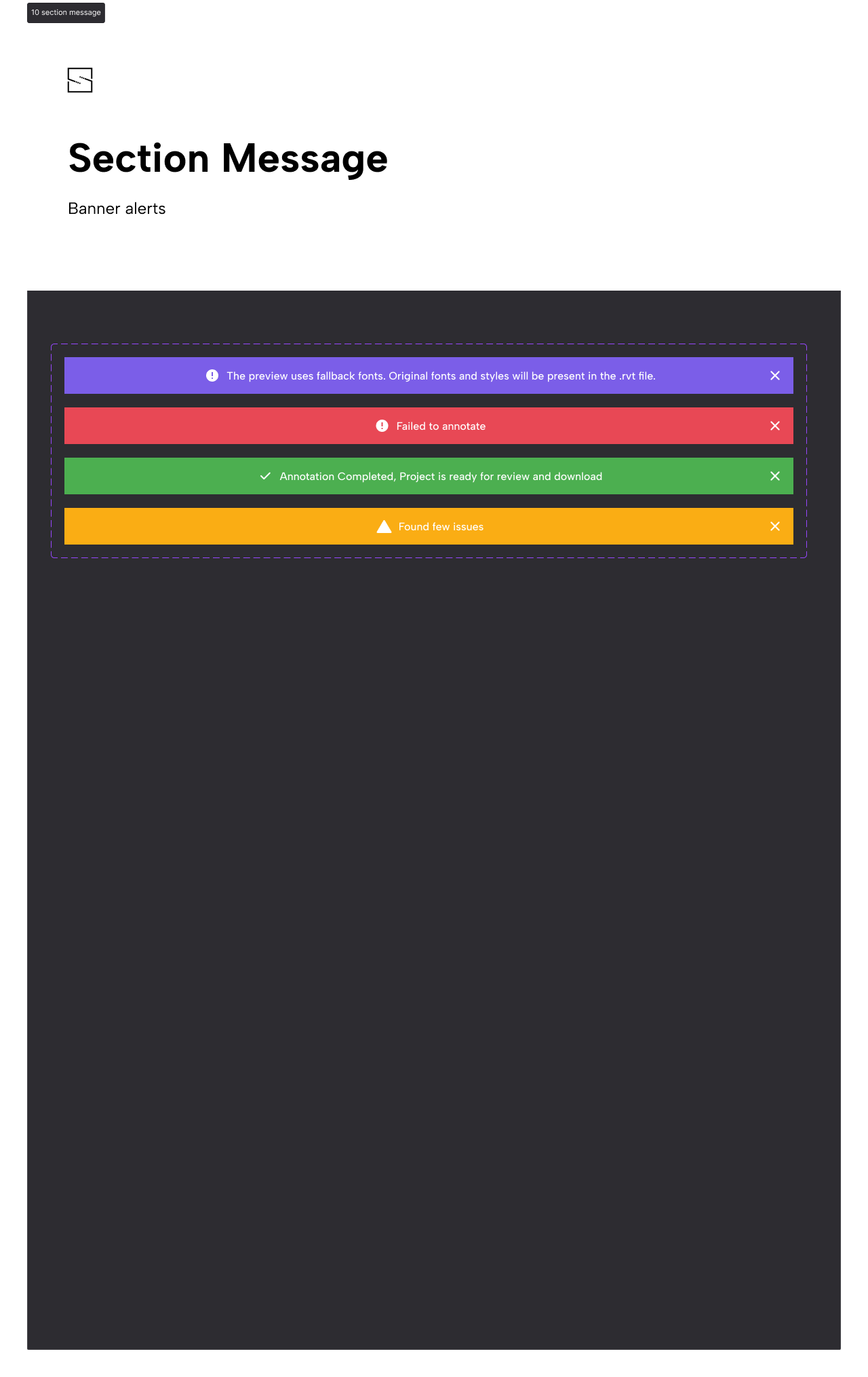
With the foundational elements of color and sizes established, our focus shifted towards refining the design system to ensure consistency. We meticulously looked for a color scheme that adhered to accessibility guidelines. Additionally, we began designing the atom parts of the design system, laying the groundwork for the comprehensive framework that would govern all future design decisions.
Atoms Molecules and Composites

In conclusion, the implementation of the design system has brought significant benefits to our work. By establishing a standardized framework for design elements, we have accelerated both the front-end development process and the QA stage.
Furthermore, the utilization of predefined elements and principles has facilitated our UX process, enabling us to swiftly create new screens and interfaces. The introduction of the concept of layers made it easier to envision the appearance of subsequent views.
Furthermore, the utilization of predefined elements and principles has facilitated our UX process, enabling us to swiftly create new screens and interfaces. The introduction of the concept of layers made it easier to envision the appearance of subsequent views.